How to Effectively Shorten Text in Your Application Using CSS?

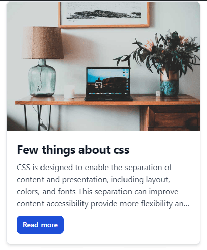
In the world of web development, we often encounter challenges in presenting content effectively. Especially in web applications, where space is limited, it's important to show users only the most essential information. An example is displaying articles or blog posts, where instead of the entire text, only a fragment appears with an invitation to read more indicated by three dots (…). How can this be achieved in a simple and elegant way?
The answer lies in using the CSS property: -webkit-line-clamp. It doesn't require additional libraries or complicated JavaScript code. Just a few lines of pure CSS are enough to achieve the desired effect.
Let's take a closer look at the -webkit-line-clamp property with an example:
1.description {2 display: -webkit-box;3 -webkit-line-clamp: 3;4 text-overflow: ellipsis;5 overflow: hidden;6 -webkit-box-orient: vertical;7}
Analyzing the above code:
display: -webkit-box; – This setting is necessary to activate the line-clamp feature. It enables us to apply the remaining properties.
-webkit-line-clamp: 3; – This is the core of our setting. It limits the displayed text to three lines. This is a flexible value, so we can change it as needed.
text-overflow: ellipsis; – Adds the characteristic three dots at the end of the text, signaling to the user that the content is longer.
overflow: hidden; – Hides the part of the text that does not fit within the designated area, working in conjunction with the previous settings.
-webkit-box-orient: vertical; – Specifies that the elements are arranged vertically, which is important for the proper functioning of the entire setting.
It's important to remember to apply all these properties together to achieve the desired effect.
Effective Use of -webkit-line-clamp:
Using this technique can significantly improve the usability and aesthetics of your application. Users receive a short, readable snippet of text that encourages further exploration of the content. This is particularly important on mobile devices, where screen space is limited.